27
By: admin
The packaging is so much more than just a good-looking box. It has a lot of intricacies that one must keep in mind. If you succeed in designing a perfect product packaging, mark my word, you successfully win a huge customer base.
Now you must be thinking that it is going to be a tedious and technical job. Well, no, this is not the case. It is easy and very creative work. In fact, it’s not about packaging only, whatever one wants to design, creativity is the key!
The bottom line is, your product and brand can and will stand out in the market flooded with brands, you just need to be more creative with your product packaging.
Let’s get started with the fun of packaging design
First off, you need not to panic, even if you have never designed a product package before. Everyone has their “first-time” of something. However, there are certain technical details involved in packaging. But it’s good to know the basics first rather than jumping straight into the technical part. Here are the essentials of product packaging design:
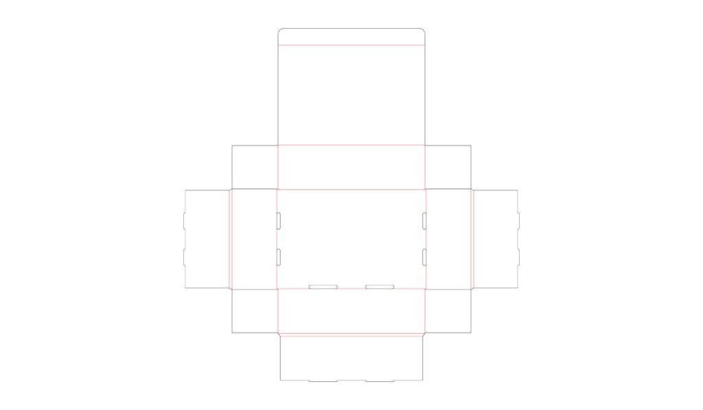
Die lining is the key feature of designing your product package
A die line is basically a 2D representation of 3D packaging that can help show your design in the form of a flat surface. Further, it leads you to prototype. Die lines cover the two important aspects of your packaging; printing, as it helps to determine the position of each artwork element to be printed on the box and then for the designing, it helps to figure out the right layout. This unassembled form of the box essentially guides the operator as to how precisely cut, crease and glue the box in accordance with the product features.
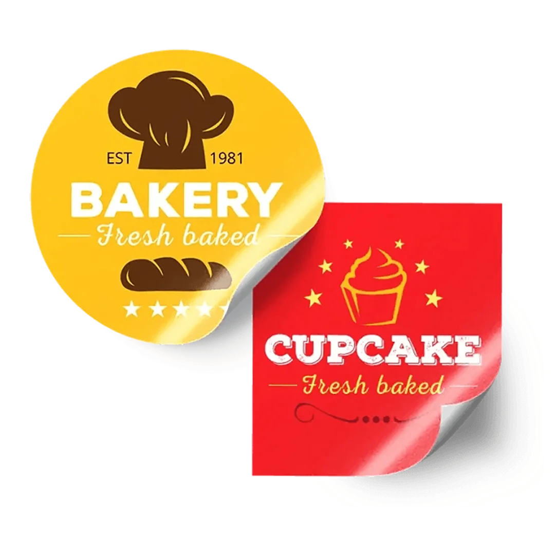
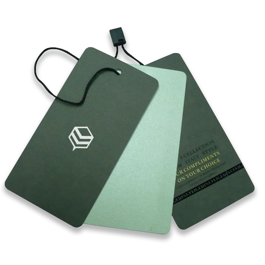
What kind of colors can you use?
Spot colors are ink colors printed using a single run. There are some standard ink selections, premixed from a numbered list commonly provided by the Pantone Matching System (PMS) in North America.
The word “spot” depicts that the colors are only applied to areas assigned for that particular color. This ensures consistency and it is economical as well.
CMYK and RGB concept is another important factor for coloring. If you want to know the basics of printing, you must familiarize yourself with CMYK and RGB, these are the default and only color outputs for printing. The bottom line is, they allow you to create unlimited artwork possibilities. Oh, and CMYK stands for Cyan, Magenta, Yellow, and Key (Black) and RGB stands for red, green and blue.
Which one is better?
Working in CMYK color mode when doing your design on programs such as Adobe Illustrator or Photoshop provides a more accurate color appearance, especially when you are printing on paper. That is why it is highly recommended that designers do not work in RGB color mode.
Did we miss the Pantone Matching System (PMS)?
PMS, also known as, Pantone Matching System (or spot color), is a standardized color matching system by Pantone Inc. It creates a uniform color code; hence, it is an excellent choice for branding. Furthermore, It will allow you to print a wider range of colors with high consistency. If you want all your colors to be consistent for every print no matter where you get your packaging printed from, Pantone spot colors are the best choice. However, one thing that you must keep in mind is that it typically requires an additional cost for production.
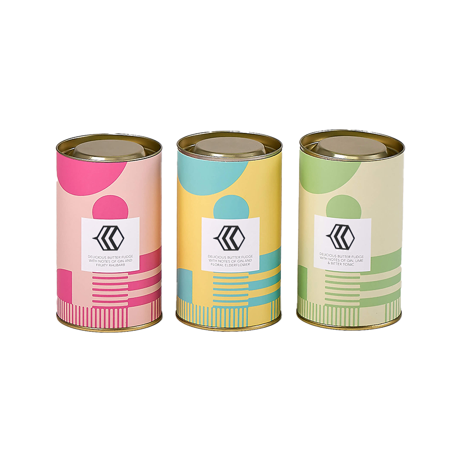
Let’s add more sugar to make it sweeter
To make your package more enticing, the coating is a great option to go for. A coating is just another layer that you add to your package, you can apply this to complete the look while it offers additional packaging protection and enhances the quality of your printing. Since the beginning of the modern packaging industry, a lot of innovations have been introduced into the market.
I will walk you through these options;
- Lamination (Matte & Gloss):
Both kinds of coatings are the best suited for your product because it can help achieve the ultimate matte & glossy finish. Matte has no shine, it’s more like a plane surface with any color. However, the gloss coating provides a very impactful shine. Not only that, but gloss lamination also provides protection against moisture and dust, but Matte is not very efficient for that matter. Thus, choose wisely as per the requirement of your product.
- AQ (Aqueous) Coating
Aqueous coating, as you can tell by the name, is a water-based coating with a clear finish. It dries very fast for the fact that the layer is thin and watery. Moreover, it is environment-friendly, which is why it becomes a great choice for food, household, and fast-consuming products. It has a very faint gloss finish compared to the other kinds of coatings.
- UV Coating
This one can create a similar look to lamination, but the difference is that UV can be applied directly to the material; no additional film like lamination is required for finishing, contrary to the matte/gloss coating.
- Varnish
The varnish is one of the most cost-effective coating techniques as compared to the rest of the coating types and has the least efficient in terms of durability. Why? Because it is not suitable for all sorts of seasons and weather conditions impact its durability. So, people don’t usually prefer it for quality concerns. Hence, it is the least popular out of the four options. However, it can produce matte, gloss and other coating effects.
In addition to this, there are more coatings that you may want to know;
- Metallic coating
- Pearlescent coating
- Soft-touch (velvet) coating.
These are special kinds of coatings, and that is why they have become a popular choice for brands to make their products stand out on the shelves into the market.
This was all about the introduction to the world of coating, however, once again, the more the sugar, the sweeter it is. Hence, if you are not satisfied with sweetness, I have got something more to add up to your taste of Custom product packaging.
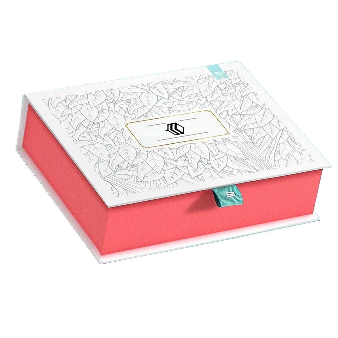
One can also use special finishing effects
If you are looking to enhance and add a little more impact and feel to your product package, go ahead and grab your customer’s attention by opting for special processes to create a more interesting unboxing experience. There are a few techniques that may come handy while you are designing your package;
Use Foil Stamping to create a unique look
This process can be utilized to create a unique look for your packaging. There are also some special effects and features that you may add to your package i.e., metallic, matte/gloss, and holographic; you could use foil stamping for this.
Use Spot UV to create the brand identity
This one is very similar to UV coating, but it is applied to a specific spot, rather than coating the entire surface of your packaging.
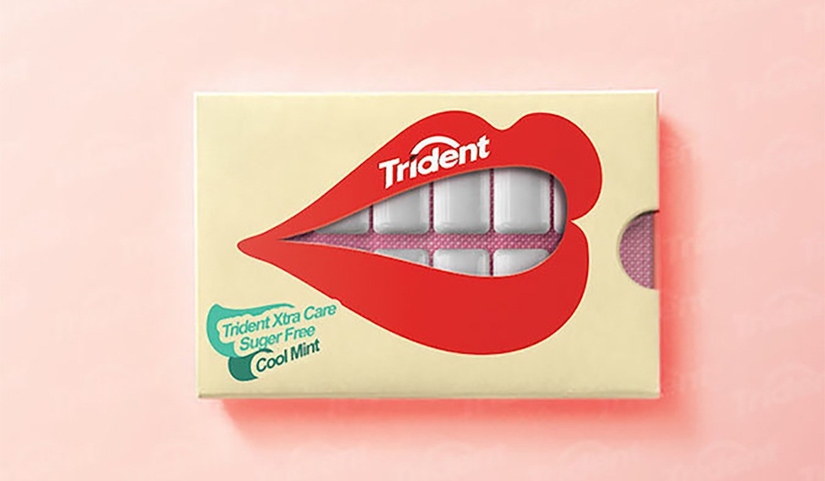
Use Embossing and Debossing for highlights
You can add dimension and depth to your packaging by using the embossing feature. Basically, in the process of embossing, you can raise the textual content or an image by pressing into the card stock or paper to highlight it.
Just like embossing, we have its counterpart i.e., debossing.
This feature creates a depressed imprint of your text or image/animation on the card stock or paper surfaces.
These are the important features that you can use to make your product packaging unique and the richer experience of your valuable customers.
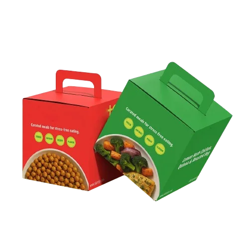
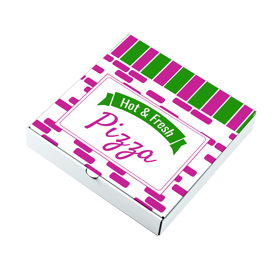
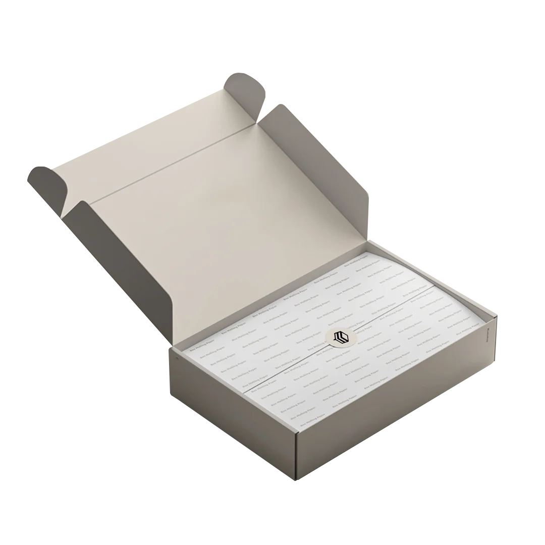
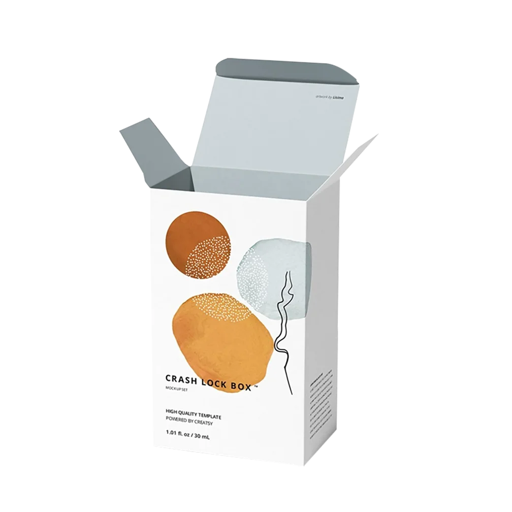
What kind of box should you be using?
Well, that’s not very difficult to decide. There are different kinds of boxes that one can utilize according to the product. However, cardboard is the basic material. An important term “Caliper” refers to the weight or thickness of the cardboard. It must be considered for product protection. For corrugated packaging, the caliper is known as the flute.
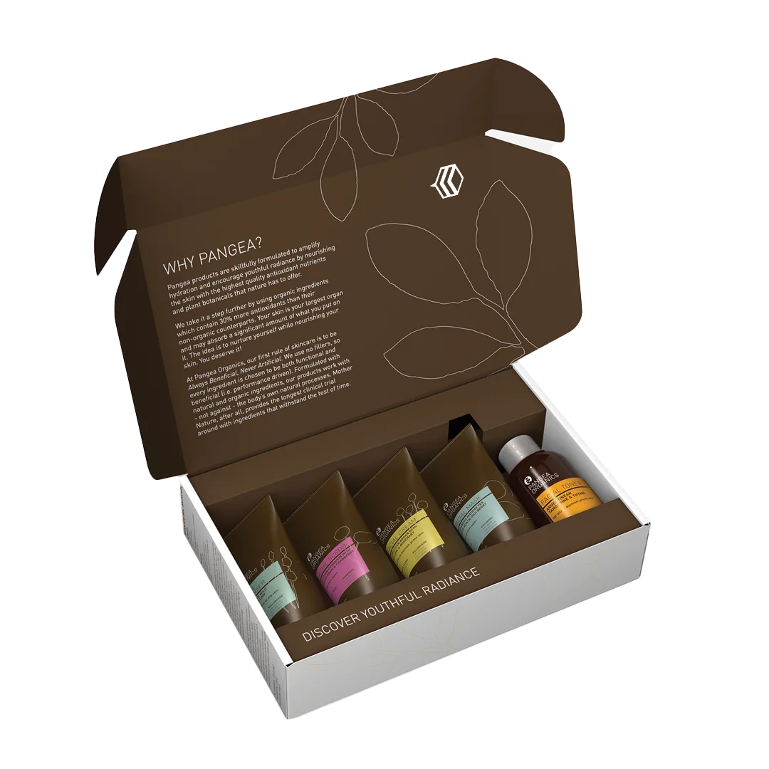
When it comes to protection, there is no compromise. Product packaging involves more than one layer for several purposes that are explained below;
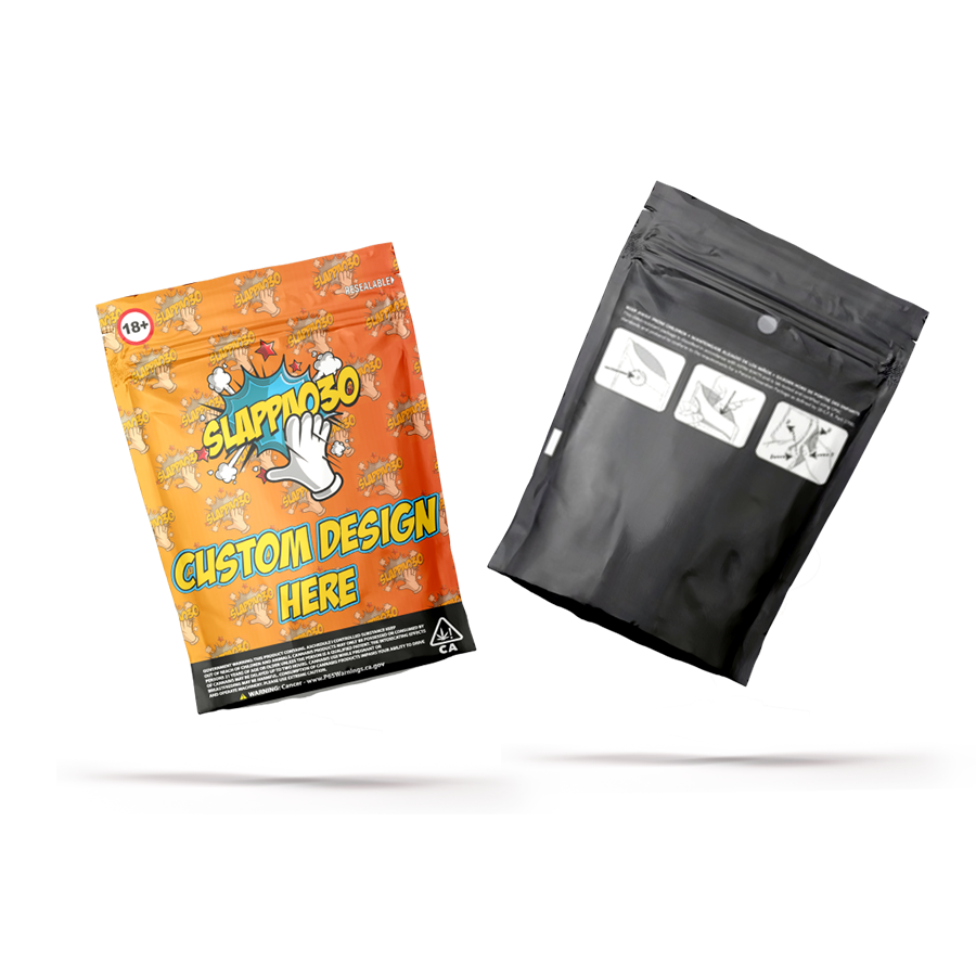
Is the primary packaging layer essential for protection?
Primary packaging is the layer of packaging that contains the product itself.
It is constructed essentially with the product layout in mind and provides an element of protection for storage. For example; shrink-wrapping, clamshell packaging, and blister packs.
Then why do we need a secondary packaging?
Well, secondary packaging differs from primary packaging because it does not come into direct contact with the product. Its basic function is marketing for the brand and presentation. It is also used for logistical purposes.
Now you are familiar with the basics of packaging design, however, there are some more details in order to achieve perfection.
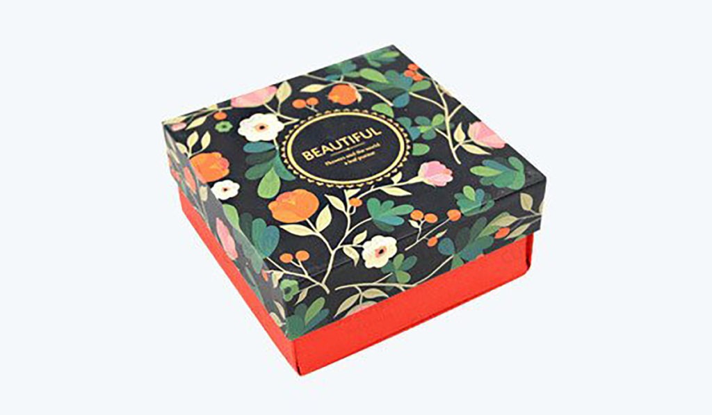
- People have favorite colors for a reason. There is a whole psychological reasoning behind choosing the right colors that eventually impact the buying behavior of the customers. Hence, one has to be very smart about choosing the right color that will tell your brand story. Darker color tones are generally representative of trust and the established position of a brand; however, lighter colors or pastels are good in terms of setting a soothing tone. The choice is yours.
- Choosing the right font is another aspect that may tell the story of your brand. You can make the product look professional by using fonts like Times New Roman or Serif or you can use funky fonts styles, as suitable for your product.
- You can use intuitive and easy to recognize patterns to design your package.
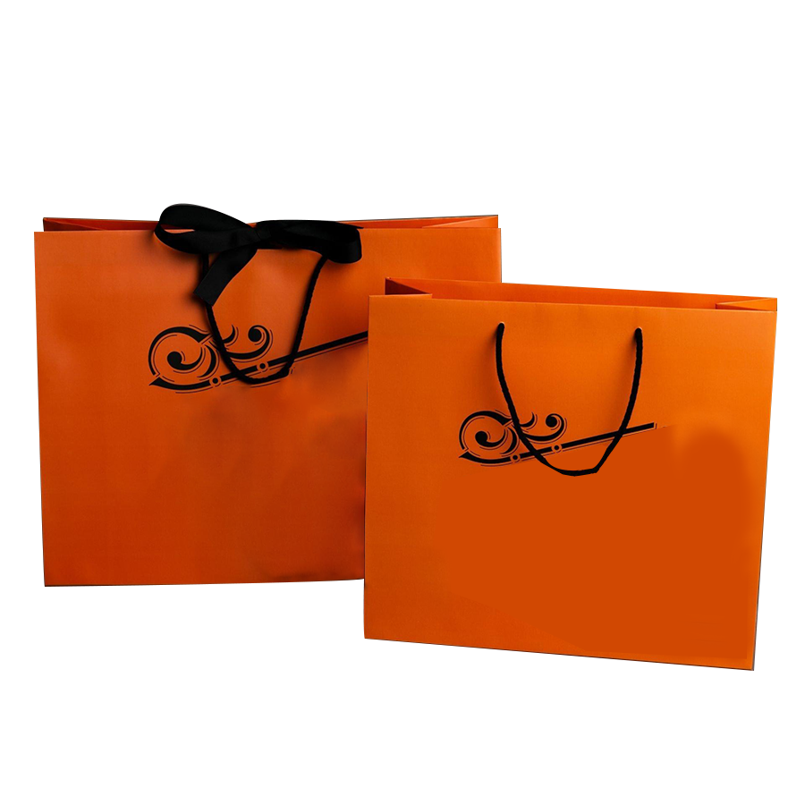
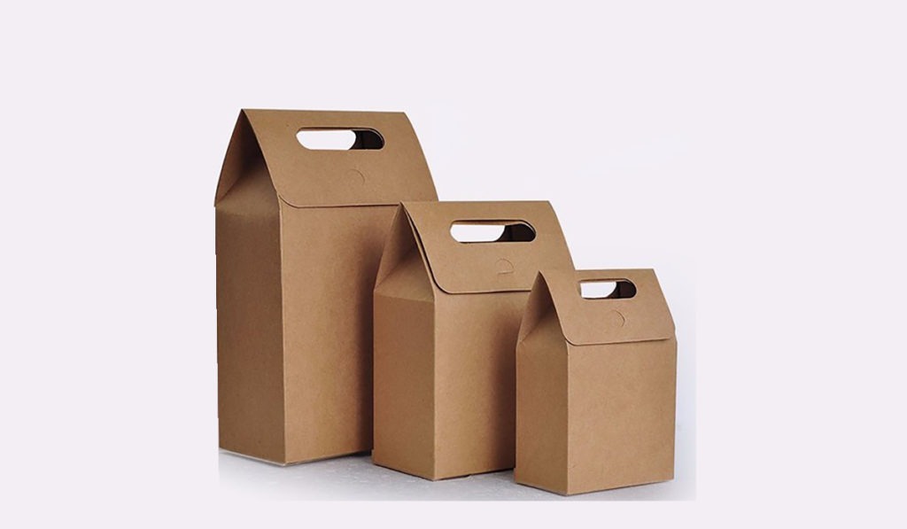
- The kind of box that you use to pack your product also has an impact on the customers. For example; Kraft is a well-accepted material by almost all the buyers for the fact that it is user-friendly.
Pro-tip: In case you decide to print on kraft, use dark colors. Why? Because bright and saturated colors sometimes appear muted on it due to its brown surface.
Conclusion:
One cannot learn all the possible details about packaging design in a single sitting. However, these guidelines will at least get you started, the rest you will know once you start doing all of this practice.
Happy learning!